We often see misleading headlines about crime in the media — and one recent example inspired a map layer I created and shared here on Felt
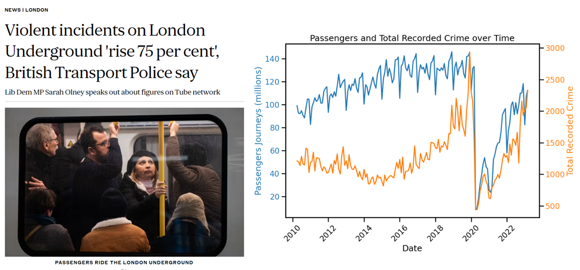
Several national and regional newspapers reported a “shocking” 75% rise in recorded crime on London’s transport network, particularly the Underground. But the reality is more nuanced: the increase in crime closely mirrors the post-pandemic return of passengers, as explained by the London Assembly.
In other words, crime rose because people came back — not because the network became less safe. It’s a classic case of needing the right denominator when interpreting crime rates in context.
If you’re interested in this topic, I recommend reading Solymosi et al. (2017) Alternative denominators in transport crime rates, which explores how we should think about exposure and crime risk in public transport settings.
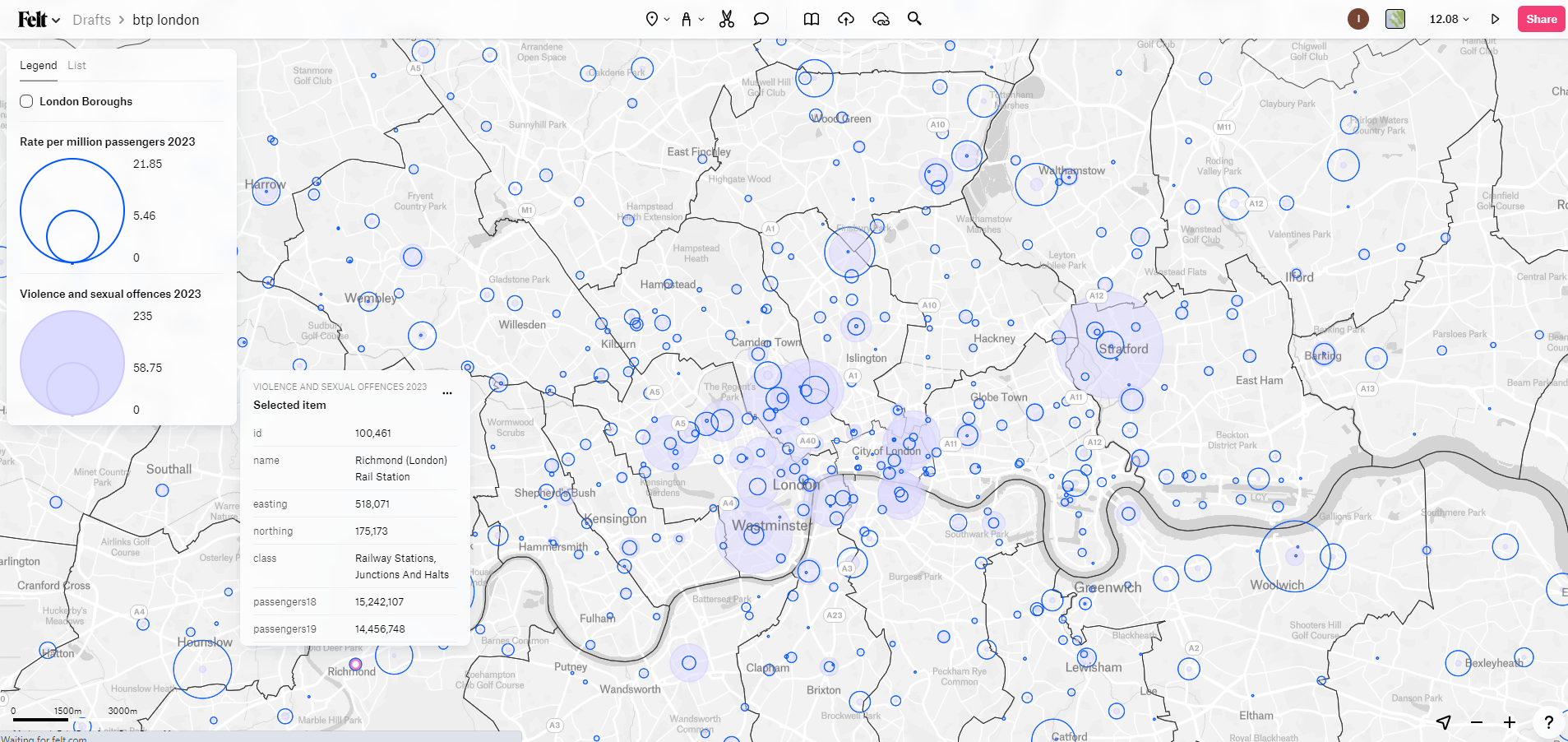
The map layer created for Felt allows the user to explore violence and sexual offences across London’s rail and underground stations.
Explore the map:
The interactive layer I created on Felt allows users to explore recorded violence and sexual offences across London’s rail and Underground stations.
NB Unfortunately Felt has moved to a pricing plan unaffordable for individual use and this will no longer be viewable without watermark
Data sources