When analysing crime patterns, it’s common to rely on timestamps that record precisely when incidents occurred. However, many crime types, such as burglaries, frequently happen within uncertain time windows — for example, a burglary might take place sometime between when the resident leaves at 9 AM and returns home at 5 PM. Assigning the crime solely to 9 AM or 5 PM could significantly distort our understanding of crime patterns.
A practical solution to this issue is aoristic analysis. In crime analysis, aoristic analysis means distributing a single crime event across its entire known time window, proportionally assigning fractions to each hour.
For instance, a burglary occurring between 9 AM and 5 PM is counted as 1/8th of a crime in each hour from 9 AM to 5 PM.
In this article, I want to share two Python functions I developed to calculate aoristic crime totals easily, allowing quick creation of accurate temporal crime distributions. Originally, these functions were part of a tkinter application I built to assist crime analysts in generating plots without the need for coding. Here, I provide two separate versions: one for standard date formats (day, month, year) and another for US date formats (month, day, year).
There are numerous alternative tools available that have been created to produce aoristic analysis:
## Introducing My Aoristic Functions
I’ve built two Python functions to simplify aoristic analysis, which you can access directly from my GitHub repository. The functions are:
- aoristic(input_csv=None, input_df=None, comm_date_fr=’comm_date_fr’, comm_date_to=’comm_date_to’, comm_time_fr=’comm_time_fr’, comm_time_to=’comm_time_to’, output_directory=’aoristic_output_eu’)
- aoristic_us(input_csv=None, input_df=None, comm_date_fr=’comm_date_fr’, comm_date_to=’comm_date_to’, comm_time_fr=’comm_time_fr’, comm_time_to=’comm_time_to’, output_directory=’aoristic_output_us’)
Here’s a brief walkthrough of how they work.
Step 1: Import Libraries and Data
import os
from IPython.display import Image, display
import pandas as pd
import aoristic

# Test EU date time formatted data
url = 'https://github.com/routineactivity/adhoc_notebooks/blob/main/aoristic/data/dc_burglary_edited.csv?raw=true'
eu_dttm = pd.read_csv(url)
eu_dttm.columns
Step 2: Generate Aoristic Plots
This is how you can easily create visualisations (heatmaps, hourly distributions, daily distributions):
# Generate aoristic plots for the dataset
aoristic.aoristic(
    input_df=eu_dttm,
    comm_date_fr='comm_date_from',
    comm_date_to='comm_date_to',
    comm_time_fr='comm_time_fr',
    comm_time_to='comm_time_to',
    output_directory='outputs/eu_format_results'
)

# Visualise plots in notebook
display(Image(filename='outputs/us_format_results/aoristic_heatmap.png'))
display(Image(filename='outputs/us_format_results/aoristic_totals_by_day.png'))
display(Image(filename='outputs/us_format_results/aoristic_totals_by_hour.png'))
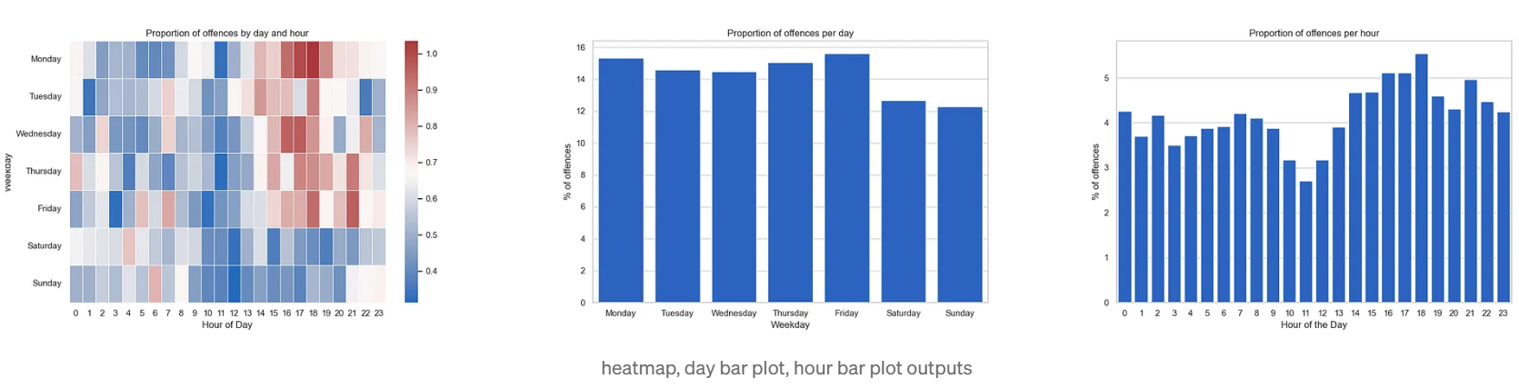
Visual Outputs
The functions produce three simple visuals:
- Heatmap: Shows the distribution of crime across days of the week and hours.
- Day Bars: Highlights crime totals per day.
- Hour Bars: Depicts hourly distributions.
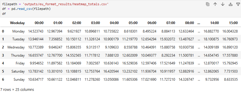
Additionally, the functions generate a CSV file with aoristic heatmap totals, allowing further custom visualisations, such as line plots showing crimes per hour for each day of the week.
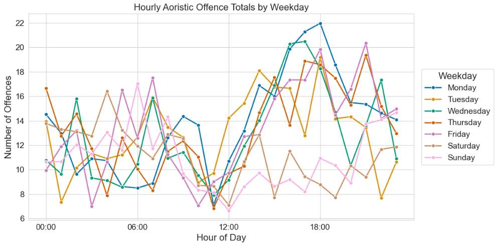
Here’s an example demonstrating how you can leverage the CSV output to create tailored visualisations, such as a detailed hourly crime trend plot segmented by weekdays.
# reshape data
df_melted = df.melt(id_vars='Weekday', var_name='Hour', value_name='Total_Offences')
df_melted['Hour'] = pd.Categorical(df_melted['Hour'], categories=[f"{h:02d}:00" for h in range(24)], ordered=True)
weekday_order = ['Monday', 'Tuesday', 'Wednesday', 'Thursday', 'Friday', 'Saturday', 'Sunday']
df_melted['Weekday'] = pd.Categorical(df_melted['Weekday'], categories=weekday_order, ordered=True)

# single plot
plt.figure(figsize=(12, 6))
sns.set_style("whitegrid")
palette = sns.color_palette("colorblind", 7)
ax = sns.lineplot(
    data=df_melted,
    x='Hour',
    y='Total_Offences',
    hue='Weekday',
    palette=palette,
    linewidth=2,
    marker='o'
)
ax.set_xticks(['00:00', '06:00', '12:00', '18:00'])
ax.set_title("Hourly Aoristic Offence Totals by Weekday", fontsize=16)
ax.set_xlabel("Hour of Day", fontsize=16)
ax.set_ylabel("Number of Offences", fontsize=16)
ax.tick_params(axis='x', labelsize=14)
ax.tick_params(axis='y', labelsize=14)
ax.legend(
    title='Weekday',
    title_fontsize=16,
    fontsize=14,
    bbox_to_anchor=(1.02, 0.5),
    loc='center left',
    borderaxespad=0
)
plt.tight_layout()
plt.show()
Bonus
For crime analysts using Business Intelligence tools like Power BI, calculating aoristic totals directly within the software can be challenging. One practical approach is to utilise the pre-calculated heatmap totals CSV provided above when using the Python aoristic functions.
Alternatively, a simple solution is the midpoint method (the midpoint between start and end timestamps), which can be easily implemented using DAX and MS SQL queries as follows:
#DAX
MidpointTime =
StartTime + ((EndTime - StartTime) / 2)
#MSSQL
SELECT
    StartTime,
    EndTime,
    DATEADD(SECOND, DATEDIFF(SECOND, StartTime, EndTime) / 2, StartTime) AS MidpointTime
FROM
    YourTable
I originally posted this on Medium